londonlime
Web
As a freelancer, I perform a full design and consultation process for web design which involves working closely with clients and with other team members. This leads to implementation, which is carried out in conjunction with a web developer, chosen by the client or recruited by me, in the case of websites using a content management system. Below are examples of websites which I developed as a freelancer, or at 10:10
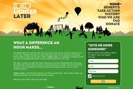
Lighter Later is a campaign to shift the clocks forward by an hour and is one of 10:10's campaigns. A non-derivative identity was created for it.

Branding and collateral for the Lighter Later campaign
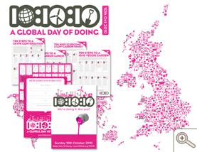
10/10/10 was the global day of action organised by 10:10 and other international groups. It required basic branding, plus a host of branded resources including a mini-site that would help people with their 'actions' as well as feeling they were part of a larger movement. In the photo below, you can see it being used all over the world.
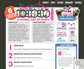
Minisite for the 10/10/10 event which provided a focus for inspiration and resources. The site is still live and can be found on the 1010 site. Do try the fruit machine on the side bar (linked to a poster generator).
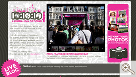
A 101010 minisite dashboard was created for the Day.
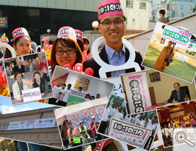
Some examples of the 10/10/10 design being used in South Korea, the Netherlands, Croatia, Nepal, Ghana, UK, and Bangladesh.
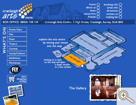
This was a full redesign for Cranleigh Arts Centre and included a custom made content management and booking system, created with a web developer. A users' manual was written for this site, allowing staff to update the site easily.
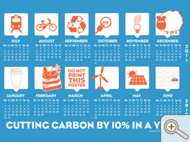
Screen calendar for the Nektarina-run hub of the 10:10 campaign. Taken by other hubs.
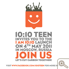
10:10 Teen campaign logo developed from the 10:10 branding. Used across the campaign on collateral.
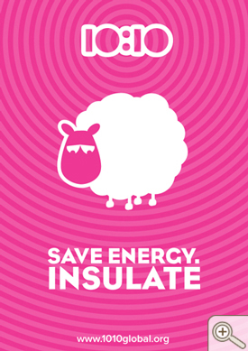
Poster from the series for 10:10 for Nektarina.

SB Management requested a three part site for their three businesses, marketing, dance and fair-trade jewellery. The front page was the entry point. The mini-sites shared a similar layout, for reassuring consistency, but with different colour schemes.
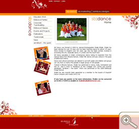
A page from the SB Dance minisite.
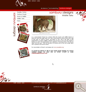
A page from the Samburu Designs minisite. This site had the luxury of beautiful animal photographs.
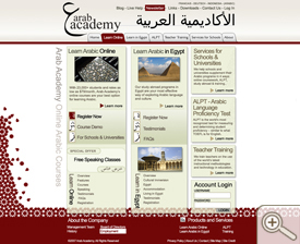
I have worked with this online Arabic language eduction company for many years. In 2001 I created a home page that served as an entry portal for their students. In 2008 they asked me to redesign the page to foreground all the content that the site now held. This had to reflect a modern Arabic aesthetic, but also appeal to the non-Arab visitor. This website is based on the Drupal CMS. A full manual was written to allow staff to manage all editorial and major administrative tasks.